5 Rules for Best Practice Email Design: Coding
 When designing an email — be it an
e-newsletter, promotion, transactional email or announcement — there are
a few standard rules to follow. Although a graphic email message may
look and feel just like a standard web page, where and how it will be
viewed is anything but standardized.
When designing an email — be it an
e-newsletter, promotion, transactional email or announcement — there are
a few standard rules to follow. Although a graphic email message may
look and feel just like a standard web page, where and how it will be
viewed is anything but standardized. Aside from having to contend with the suite of standard web browsers (Chrome, Firefox, Safari, IE) and their idiosyncrasies, you also have to satisfy the requirements imposed by a slew of email clients and mobile apps, which don’t always render your messages the way your design intended them to.
Although constraints are a challenge, when trying to design something compelling, sticking to these best practices will ensure that your emails render beautifully across all clients a
nd on mobile devices.
Rule #1. Design on a Width of 600 pixels
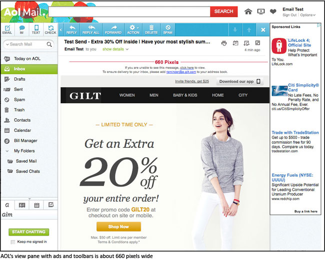
Emails are viewed in a variety of clients, and many different factors — advertisements, menus, and toolbars, just to name a few—can impact upon and minimize the view pane of the message.The standard width for most emails is around 550-600 pixels, although the trend toward wider emails is increasing—and scalability, even on mobile devices, has improved with time. In short, if your design has to be wider than the 600 pixels, keep it under 700 pixels to be on the safe side.
Rule #2. Use Background Images Sparingly
Since version 2007, Outlook has provided zero background image support. When using layered images in your design, be sure they can degrade gracefully. Always use a solid background color as a fallback for Outlook and make sure no crucial information or imagery exists solely in a background image.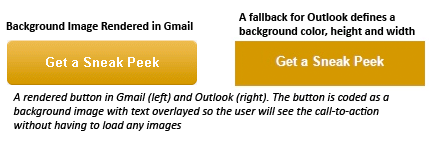
Background image with fallback for Outlook
Rule #3. Stick with System Fonts
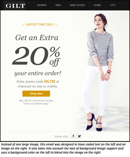
Web fonts are not widely supported in email, so in most cases you’ll need a fallback. To circumvent the general lack of support available for handling these issues, stick with web-safe fonts like Arial, Helvetica, Tahoma, Times Roman, and Georgia.Rule #4. Strive for a Good Balance of Text-to-Image Ratio
At first, it might seem that the best way to preserve the design of an email is to throw it all in an image tag or slice it up into lots of images. Then there’s no need to worry about being limited to ugly system fonts or stripping of the background images, right?Not quite. An image-heavy email will increase the chances of your email client flagging it as spam, resulting in damage to your sender reputation.
As a general rule, the best way to avoid ending up in the dreaded Spam folder is to make sure that your emails reflect a balanced image to text ratio.
Most email clients block images by default. With this in mind, incorporate text that summarizes the main point of your message: the offer, the announcement, the transaction taking place, the action for the consumer to take, etc. Some text — especially the main call to action — should be viewable upon opening the email, even if the images are shut off.
Rule #5. Consider a Mobile-First Design
It’s true, CSS support in email has come a long way, and we can now incorporate some media queries to allow for responsive layouts — but by no means can we expect all clients and devices to support this yet.It’s still wise to begin with a mobile-first design for optimal viewing across all platforms. Use single-column layouts, larger fonts, and clear and concise messaging and calls-to-action as much as possible.
Multi-column layouts don’t have to be off-limits for mobile, but keep them to a minimum as needed—and try to avoid going above a three-column layout.
After considering all the factors listed here, and updating your design to fit within these constraints, always remember to test your emails thoroughly on all devices and clients. Rendering tools like Campaign Monitor, Litmus and Returnpath offer a full display of the rendered image in different clients and platforms, and can really save you time and anguish.
Lauren is a front-end web developer who specializes in Email. She currently serves as the Email Build Specialist at Gilt.com, a flash sale fashion company in New York.
https://plus.google.com/104842070557192361766/posts
 About the Author
0 comments: